I’m a simple guy and I like simple things. I like books that are easy to read, wine that is easy to drink, and insights that I instinctively know are true. I grew up in a small town and never went to university, so maybe I’m just too dumb to understand why some advertising proposals need five graphs and two behavioural theories to be explained. A big part of my job when working as a brand manager at an energy startup was saying “But that’s not how people think about energy!” — and in my 4-year career I’ve often been annoyed by people who serve to make things more complicated than they really are.
Sure, many inventions were the result of complicated theories, such as transistors, vaccines and the Gutenberg press. But communication is not like that. Dave Trott explains communication in three steps-step: impact, communicate, persuasion — while adding: “This may feel uncomfortably simple for you.” Decades ago Bill Bernbach said that communication should be based on ‘simple and timeless human truths’. The sole purpose of advertising is to make you remember something, so better make it easy and simple.
That is not to say that making good advertising isn’t hard, as Lucian Trestler points out — or as Andy Whitlock says: “It’s easy to deliver a business strategy in 300 slides. It’s really hard to make a 3-slide version, but that should be valued more.”
Simple ideas are the result of clever thinking — and I don’t mean mint-flavoured parking tickets or digital billboards that spot aircrafts flying overhead. Those are also contrived pieces of fake creativity that solve nothing and answer only to the question “How can I win an advertising award?”
So for my own enjoyment — and maybe a bit of yours — here’s a list of simple solutions that work. The beauty of all these examples is that you don’t need any education or understanding on engineering or programming to come up with any ideas.

I’ve always looked at raised bumps and ribs on stairs and train station platforms as an clever simple solution to help visually impaired people navigate. Ribs indicate walking paths and bumps indicate something ominous is ahead, such as a stairs. There’s even an apt name for it: ‘tactile paving’.

The stop sign. All across the world you’ll find this red octagon with four white characters, and you know immediately what it means, just from seeing it in the distance or vaguely in a side gaze. Luke Sullivan once compared a good ad with a stop sign: “It’s simple. It’s relevant. It makes you stop.”
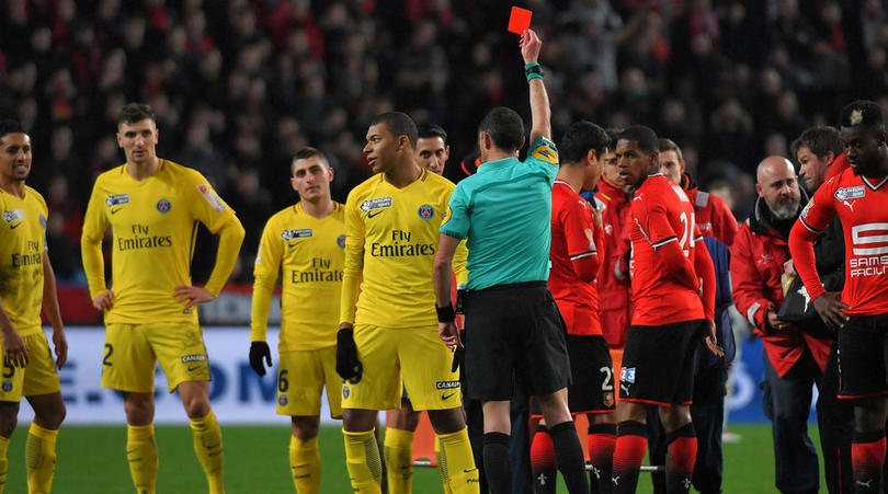
The red and yellow cards from football. In the 60’s, Ken Aston ‘invented’ the cards to communicate a warning (yellow) and ‘that’s it, you’re out’ (red) across language barriers of football. Dave Trott uses it as an example in “That is real semiotics: communication without words.”

Schiphol Airport printed fly illustrations in their toilets to compensate the lack of precision that many men have when it comes to peeing in a urinal (amplified by carelessness when using public toilets). Cleaning costs are estimated to be reduced by at least 20%.
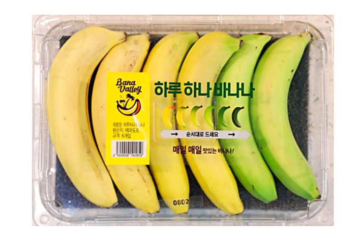
The South-Korean E-mart store sells this ‘One banana a day‘ pack, with six bananas in ranging in order of ripeness.
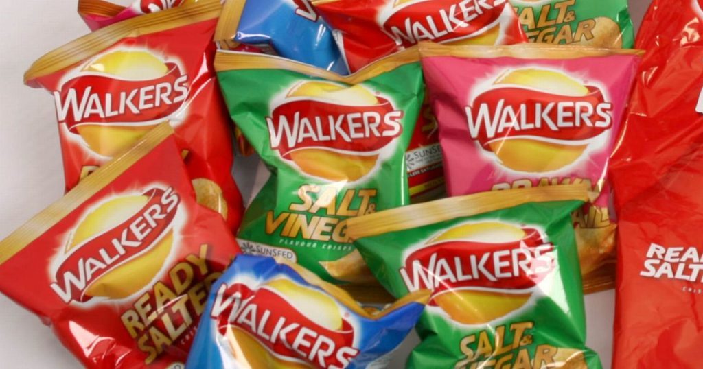
Dave Trott, in his ‘Predatory Thinking‘ talk, speaks about a village in England that had a problem with litter on the street. Instead of an expensive and patronising public behaviour campaign, the local shopkeeper solved the problem by writing the name of the kids who bought the crisps and candy on the packaging — which solved the problem overnight.
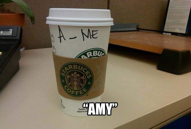
For years, Starbucks baristas have misspelled even the most easiest names, but it’s fun to Instagram your cup that says ‘Raychil’ when your name is Rachel. This is exactly why it’s such a genius social media campaign.

I adore this photo which was shared on Reddit by user MessyHook, captioned: “My little cousin wanted to be a road for Halloween, so my aunt made her this costume.”

This is a bit extreme solution to avoid paying property transfer taxes, but clever and simple nonetheless. Couple A in China wanted to sell their house to couple B, so both couples divorced, and did a ‘wife-swap’ through marriage, transferring the house without any tax before divorcing and marrying in the original setting again, thus avoiding 20% property tax.
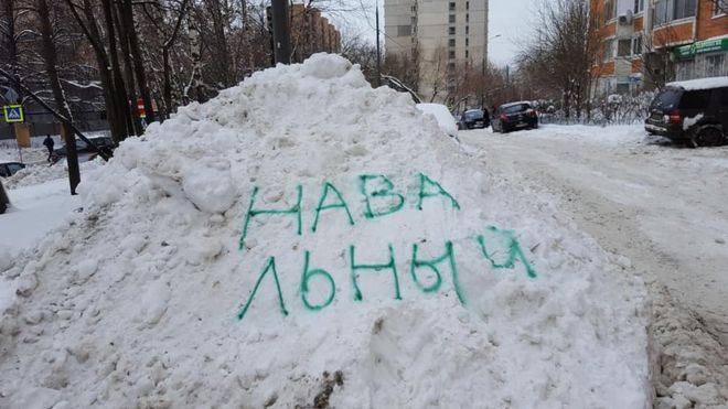
In Moscow, snowfalls can be extreme, and some citizens discovered that the best and fastest way to have authorities remove the snow is to write the names of political opponents on the snow — such as ‘Alexei Navalny’, pictured above.

When Apple launched their first mp3 player in 2001, they were late on the market. But the iPod was a great device, with a simple interface. The only problem they faced is that mp3 players are rather invisible, as they’re usually in your bag or pocket. The solution was simple: earphones before then were always black, so Apple made them in white, which was further highlighted in Wieden+Kennedy’s campaign.

In Shanghai, some parking garages scan license plates, so that visitors pay automatically — saving both time and the need for paper tickets and paying terminals.
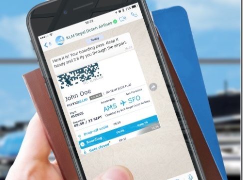
KLM doesn’t force me to download their app. They just sent it to me on WhatsApp (they already have my number).
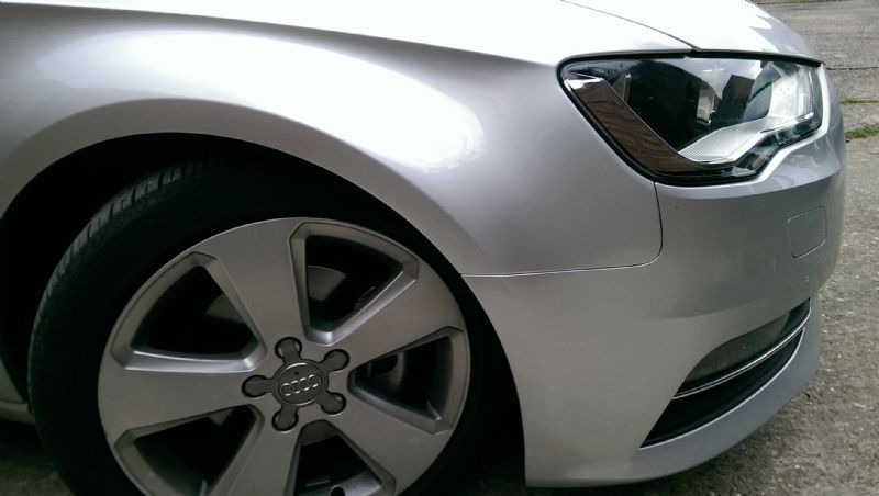
Audi’s Accident Repair service in the UK is a simple way of adding value for customers. As Louise Jack on Twitter points out: “You just take pics of the damage some moron in a Sainsbury’s car park did, upload it into an app, and they come round and repair.”

Redditor linkwolf98 posted this picture of a local Toyota dealer that placed in its showroom a car that was rear-ended by a semi-truck, to prove how safe it was for its passengers.
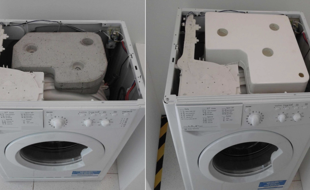
Washing machines around the world come with a 25 kg block of concrete in them, to act as a counterweight for stability during washes. But a group of students from Nottingham figured that if you simply replace it with an empty plastic container, which people can fill at home, you massively save on transportation costs. It’s also much easier to move up and down the stairs.
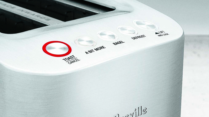
And lastly, Breville added the ‘A bit more’ button to their toaster, which is a brilliant and simple addition for when you want exactly that: ‘a bit more’.

